We’ve covered the importance of having a website before, but I’d like to go into some more detail on that subject. A large portion of people use their phones for the internet, over their computer. Lunch breaks at coffee shops, or long waits in waiting rooms. It’s not hard to imagine plenty of scenarios where people might be viewing your website on the go.
Imagine a person, a potential customer even, sitting on the train. They stick their hands in their pockets and find your card. They’ve forgotten to look you up but now they do, on their phone. You want your website to wow them. You don’t want your website to be zoomed into one corner of the page or to load slowly or even incorrectly and give a false perception of your business, and how you treat your customers. You want your website to be presentable, no matter the medium used to access it.
Lets take a look at some common problems desktop versions of sites viewed on phones have.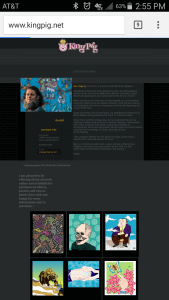
This is an example of a landing page that looks good on a computer and bad on a phone. On a desktop you can this gentleman’s bio when you arrive but on a phone, as you can see, it is far too small. You can pinch zoom on a smart-phone but the text on this page doesn’t hold up.
The text is gray on a black background which makes it hard to read if there is any sort of glare from the user visiting the website outside. In addition the text begins to pixelate when zoomed in close enough to read on a phone. You don’t want your customers to need to strain themselves in order to view your content. It should be delivered to them in a pleasant package.
Other than aesthetics here is an example of where functionality fails.
If you look closely there are a few images or buttons that have failed to load. In addition you may notice a drop-down menu. With a mouse it is easy to click on these and then select your choice from the list but on mobile it’s a bit more difficult. Fingers can be too large for the choices without zooming in and this leads to miss-presses and frustration. At Top Range Tech we tend to use alternatives like a menu pop-up.
Now here at Top Range Technologies we always create a mobile version and desktop version side by side in anticipation for the high traffic from phones our sites receive. We always try and make sure both are visually appealing and functional.
If you would like a website designed for all devices have a website made with us today.
Bonus:
Read this article about Best Practices For Designing a Mobile Friendly Site to learn more.
Recent Comments